This project was about KPIs on the effectiveness of educational programs. Fundación Telefónica Ecuador runs programs in digital education, employability, culture and volunteering, and every year each program commits to concrete goals: how many children take part in activities, how many teachers complete training, how many people attend events, and so on. Those numbers come from many different sources and teams.
As a data analyst for the foundation, I built the ETL processes in Apache Hop that collect and consolidate that data, and the Looker Studio dashboards that visualize it as KPIs. The core idea behind every screen is the same: put the plan next to what really happened, month by month, so anyone can see at a glance which goals are on track and which need attention.
Start here
The indicators overview
The first screen is a single scorecard for the whole foundation. Each program area gets its own table with every indicator, its annual progress as a percentage of the goal, and a monthly status color: green when on track, yellow when at risk, red when behind. Each table also shows the date its data was last updated, so readers know how fresh the numbers are.
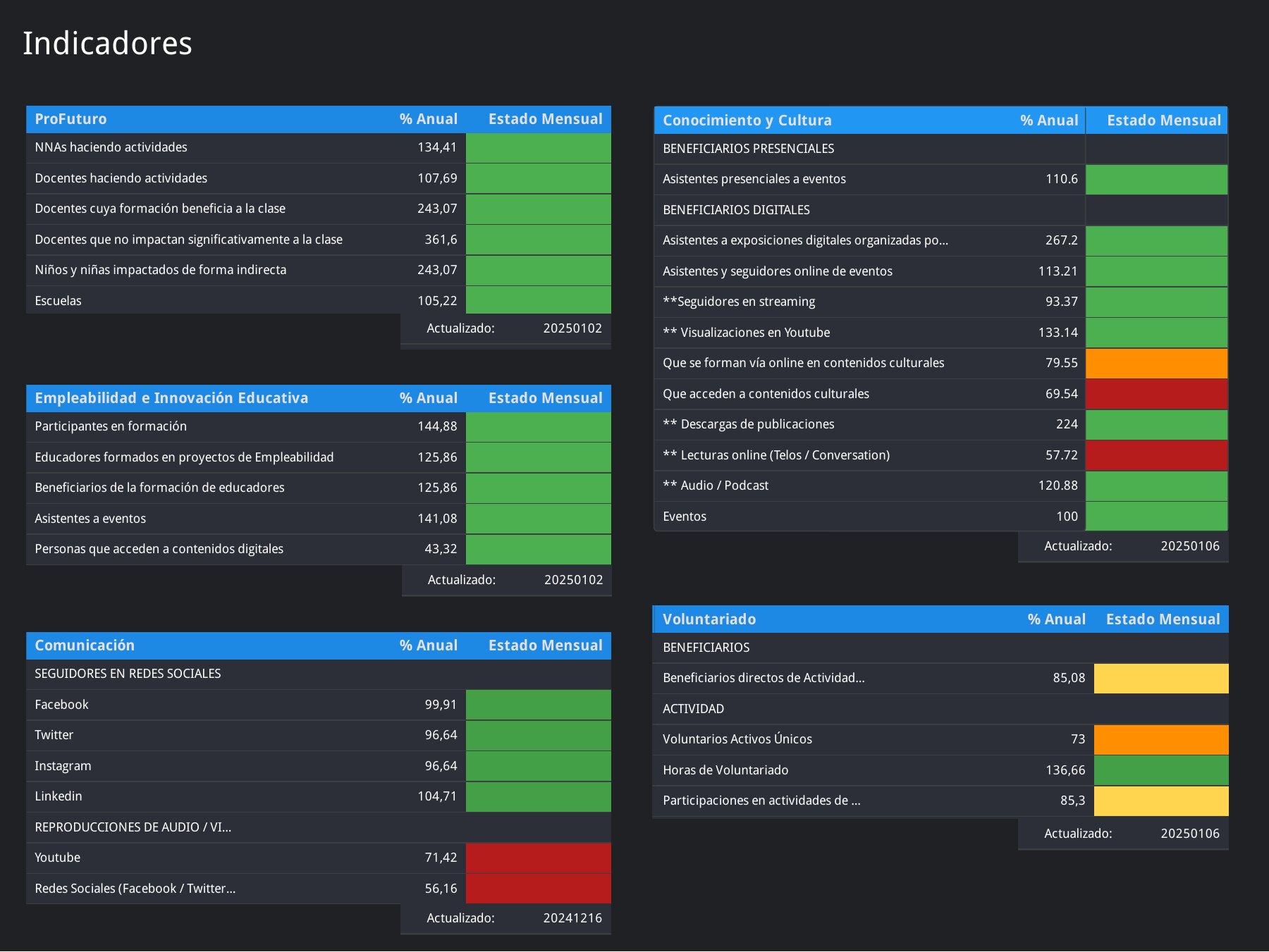
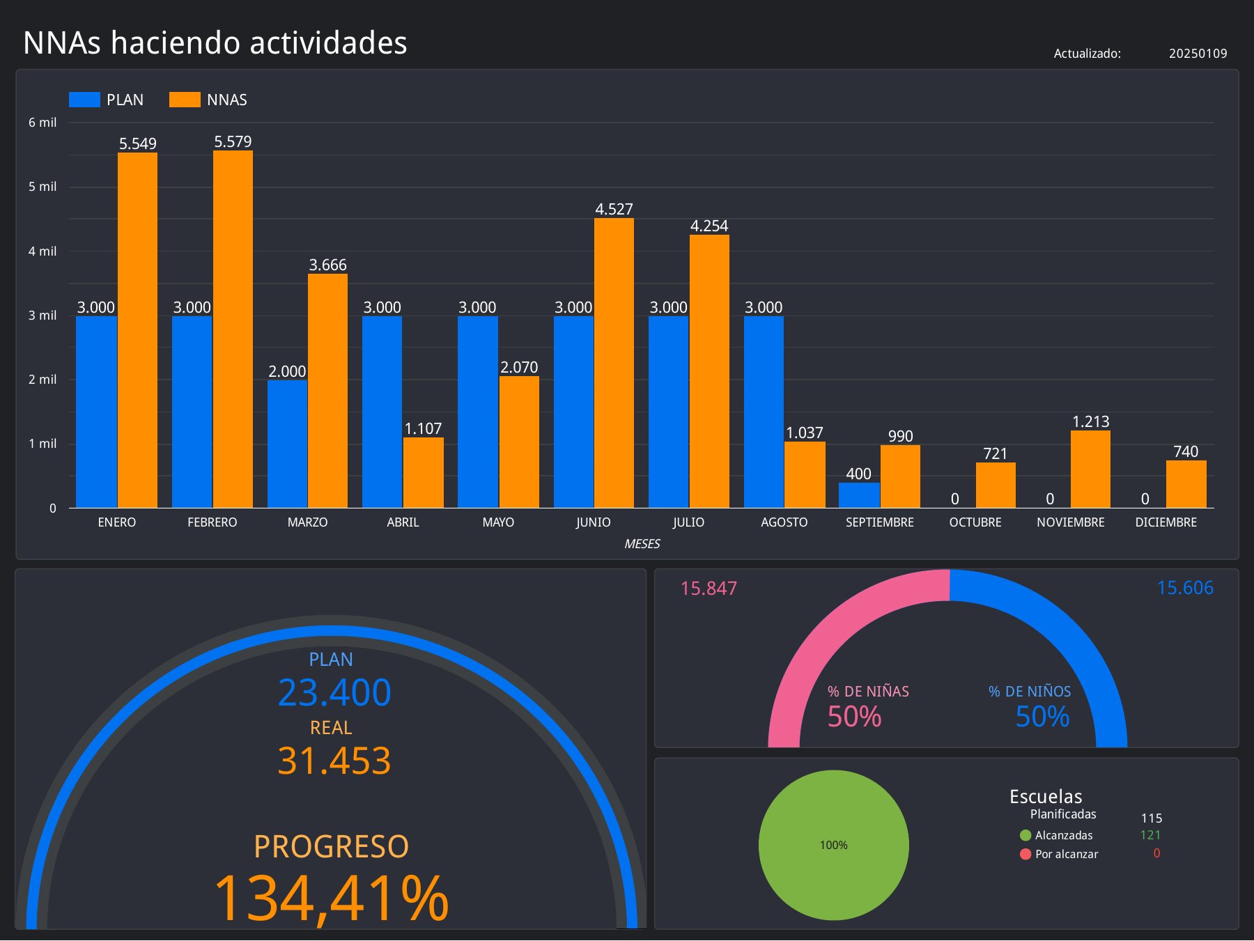
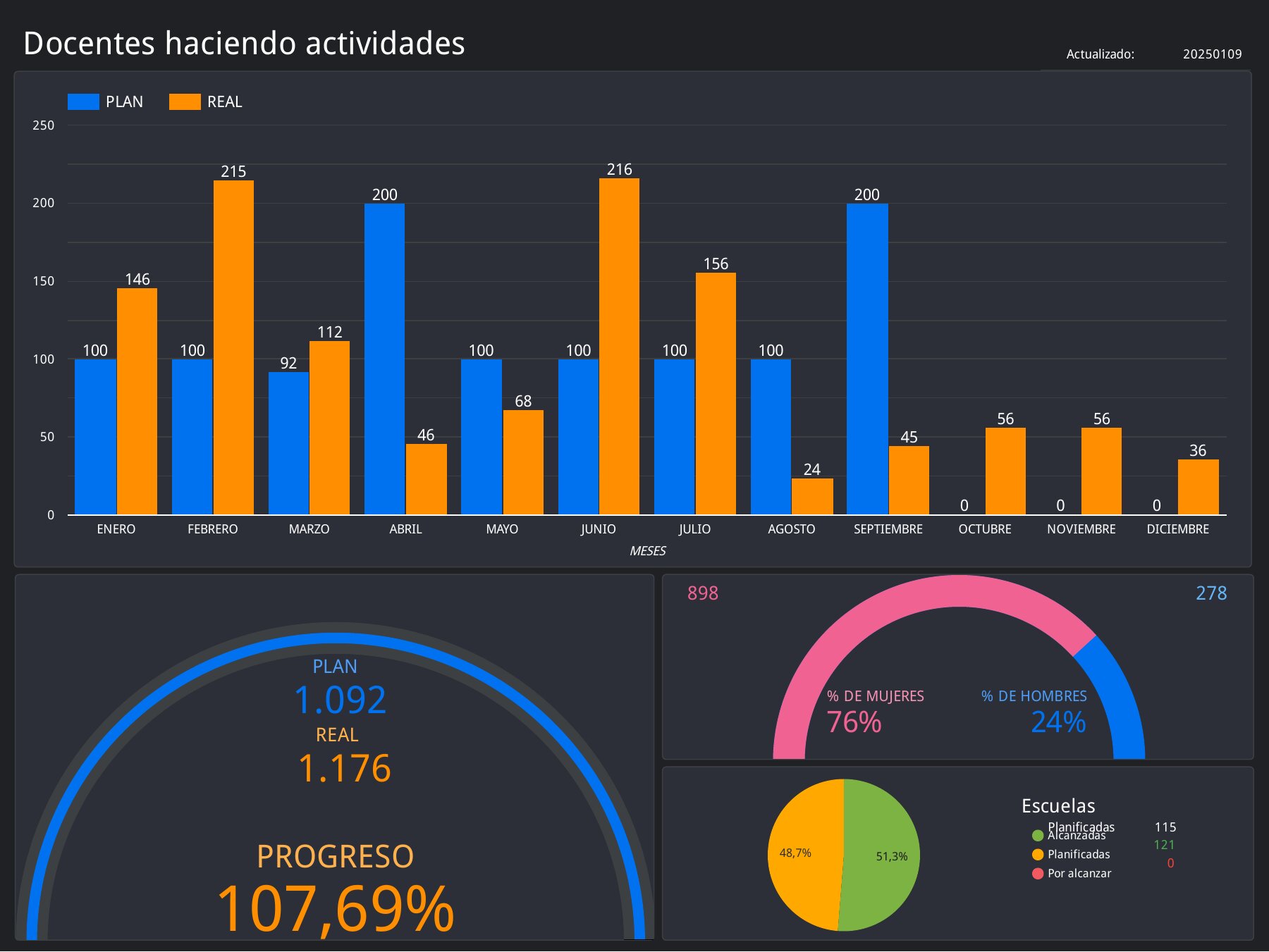
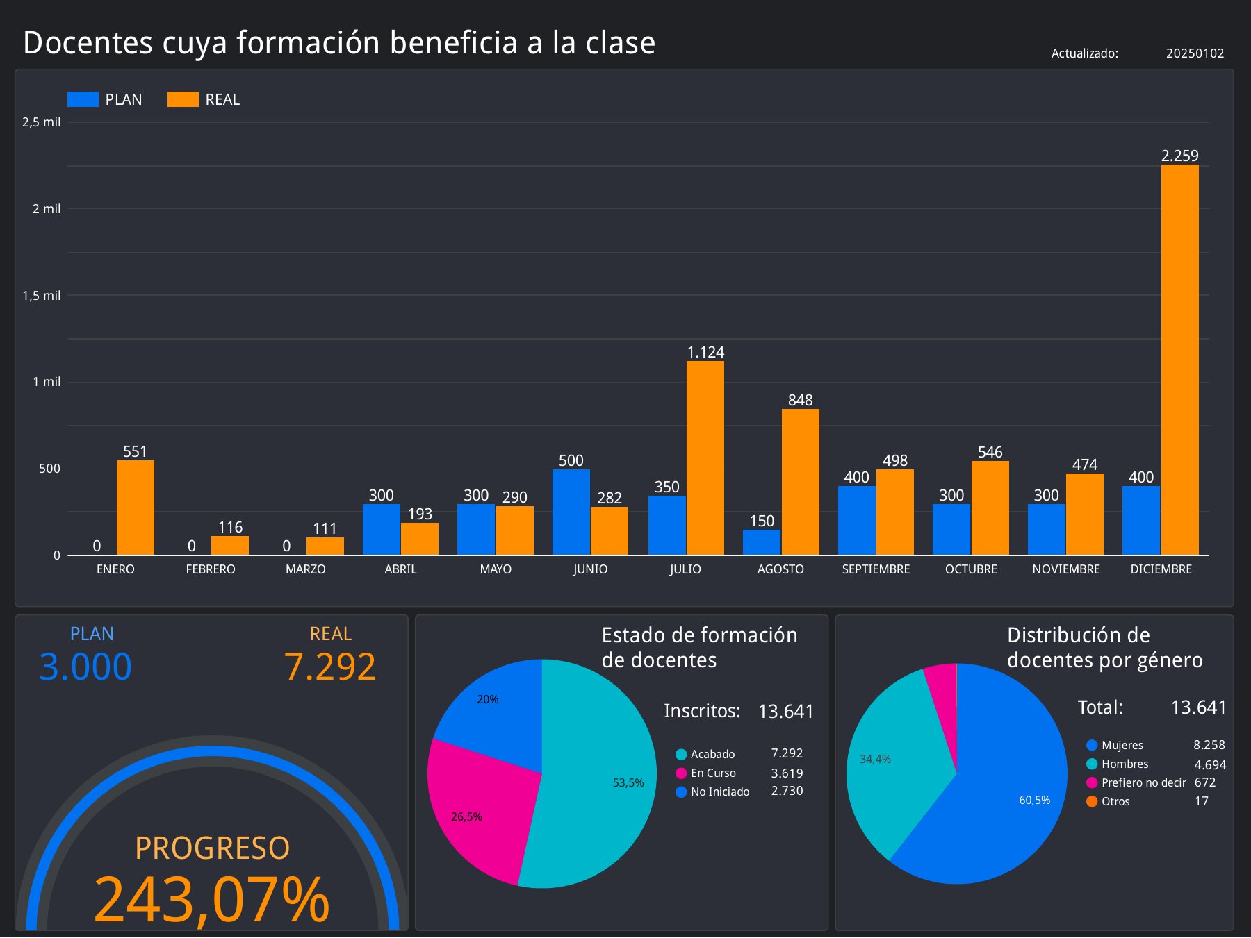
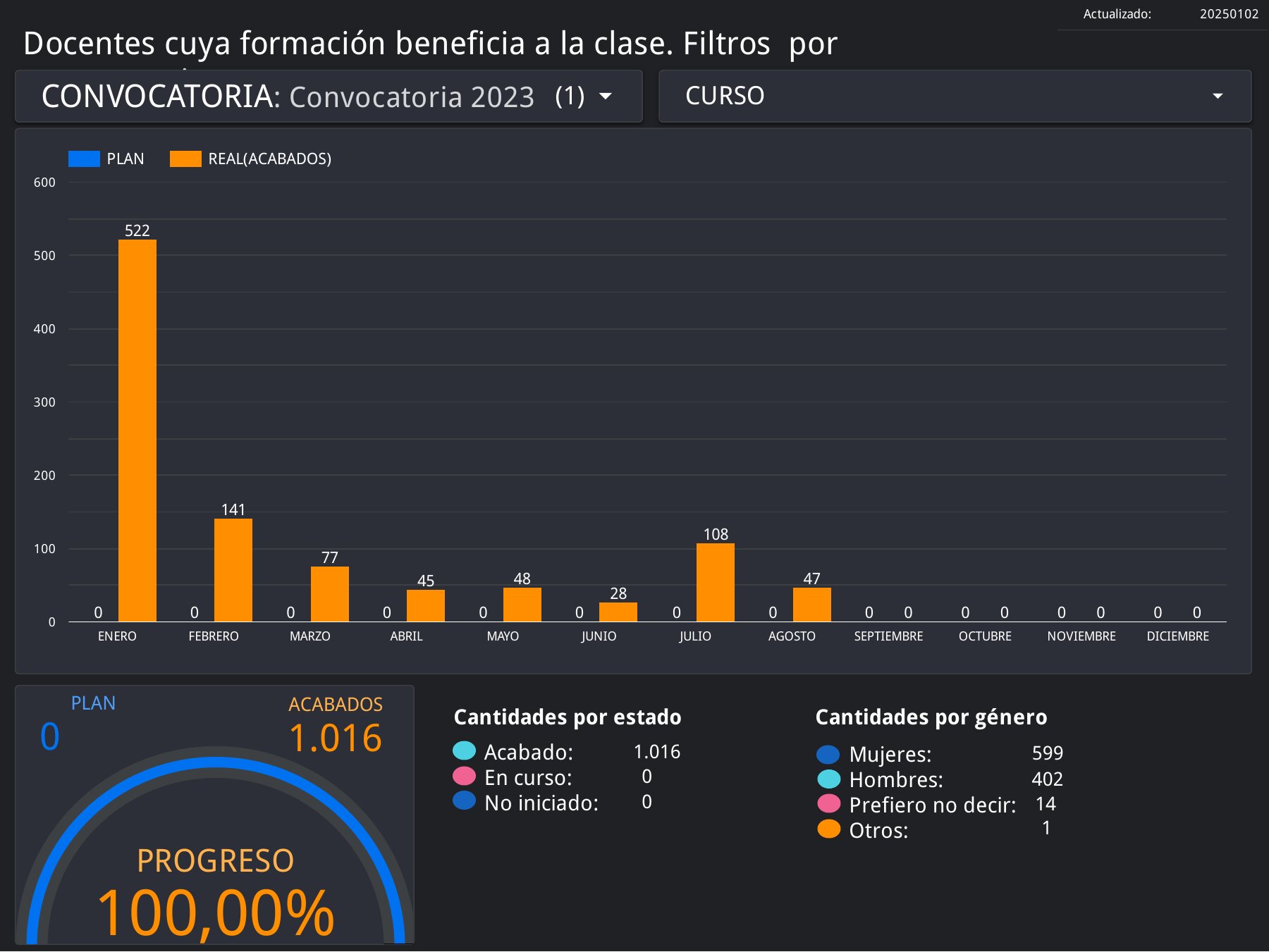
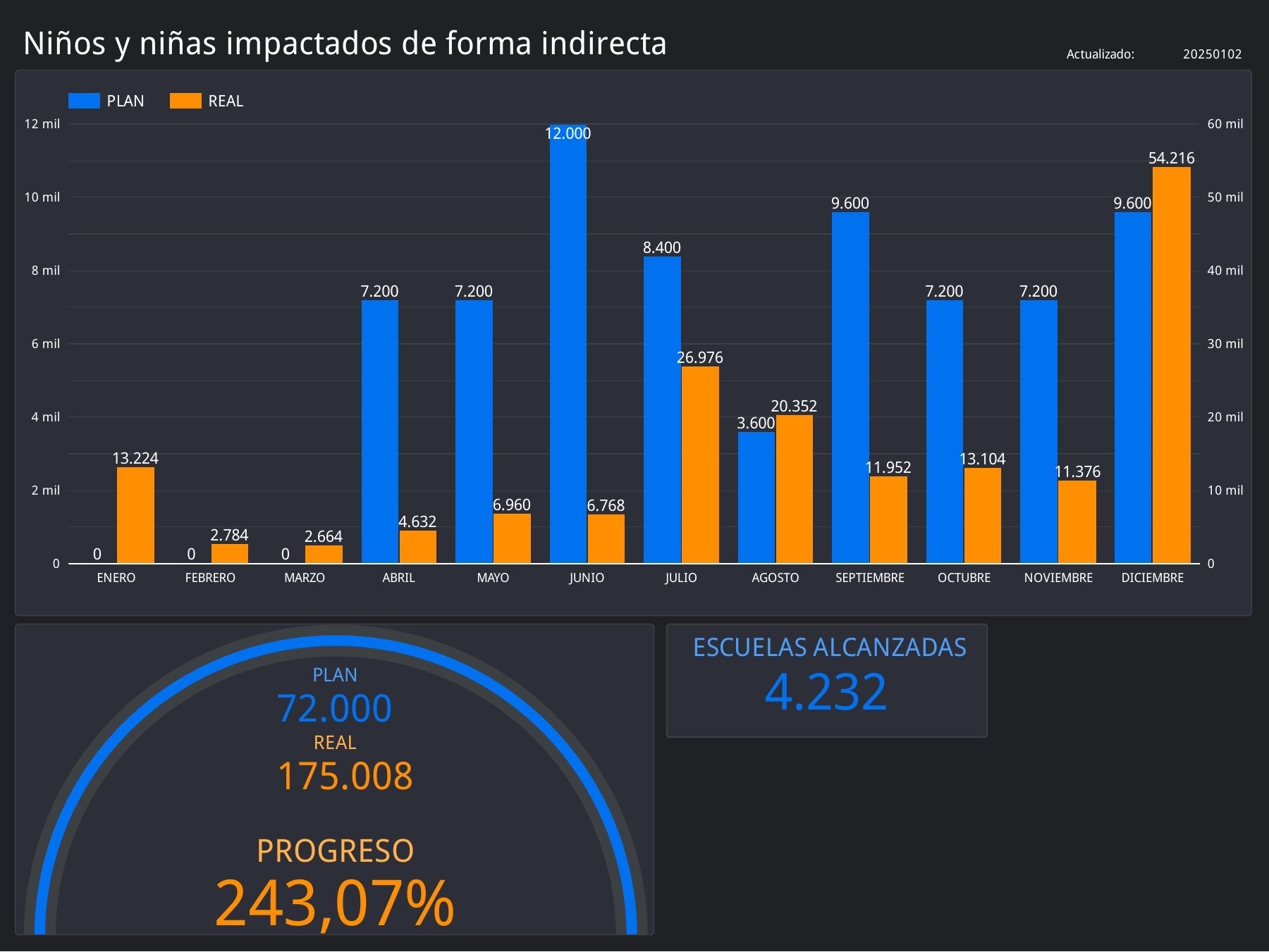
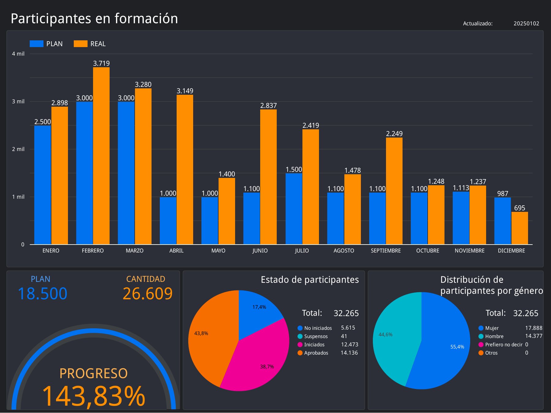
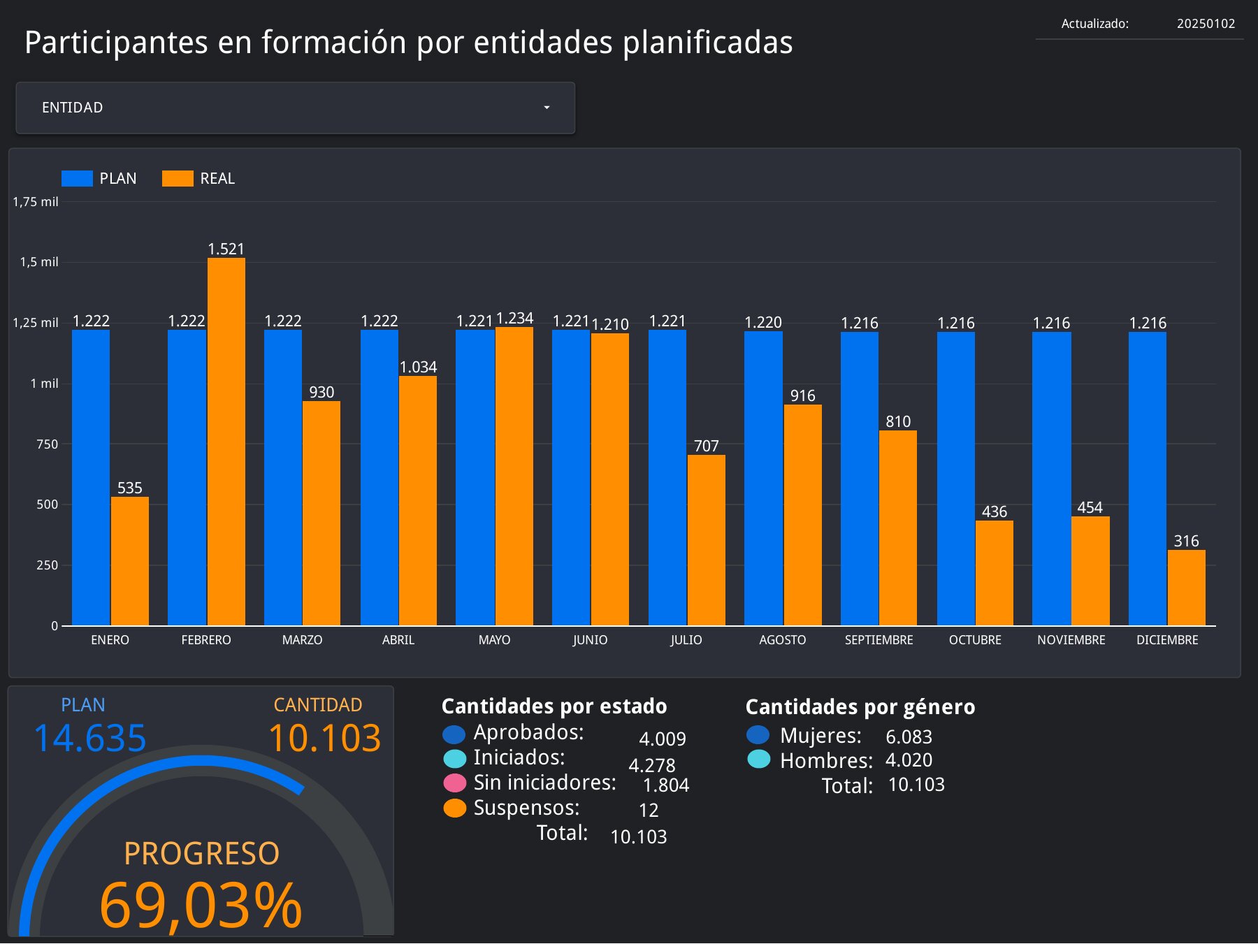
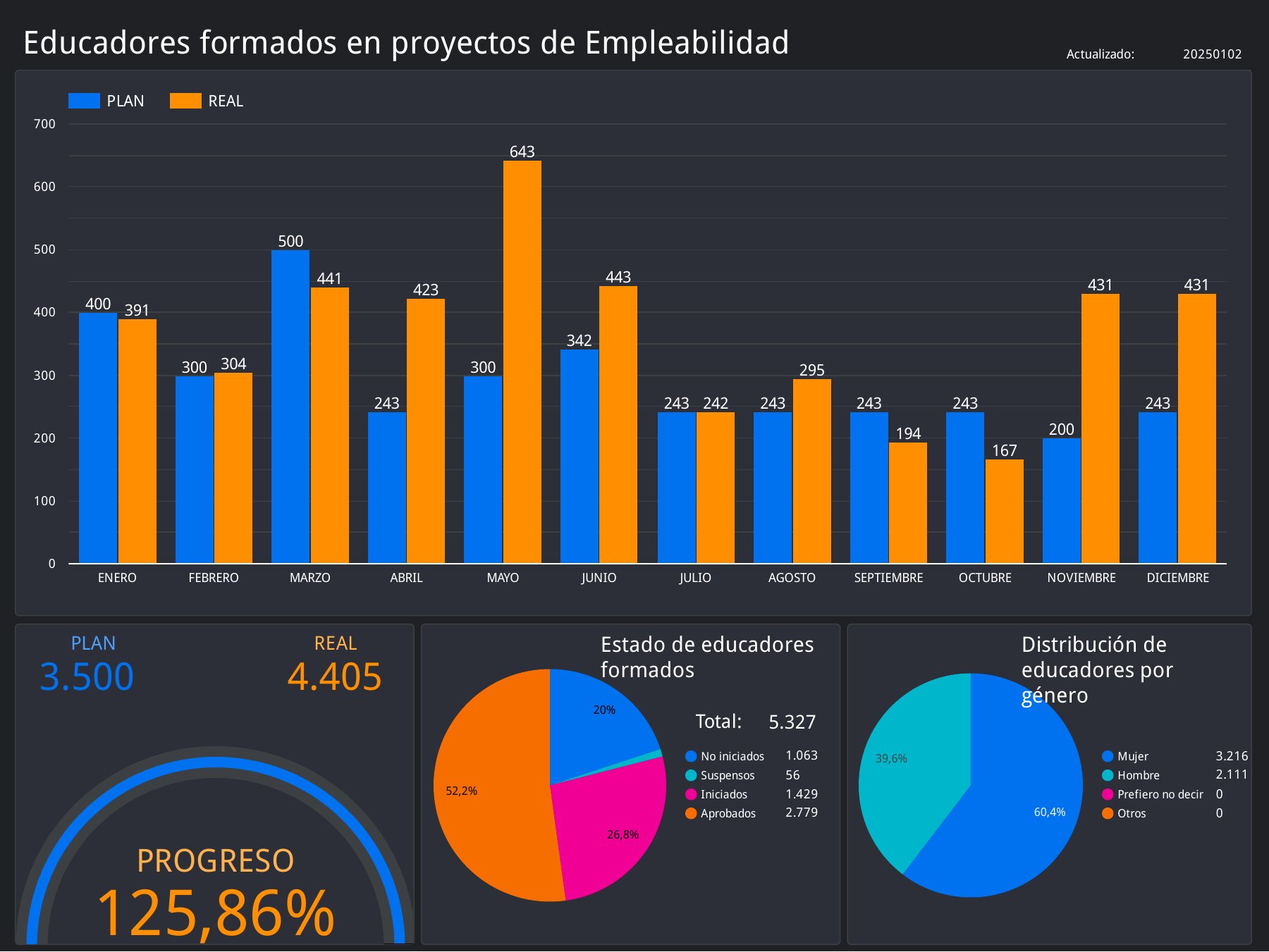
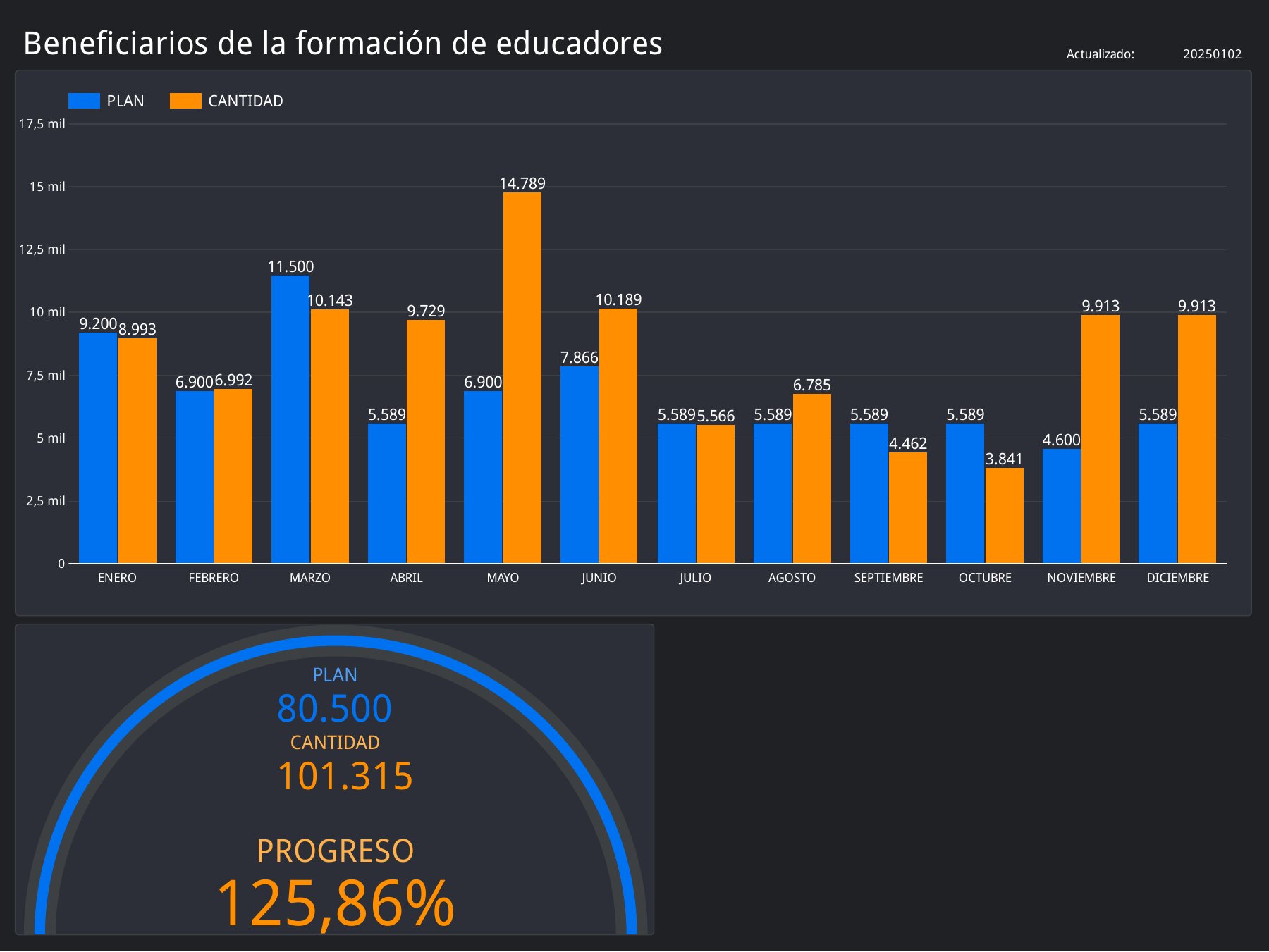
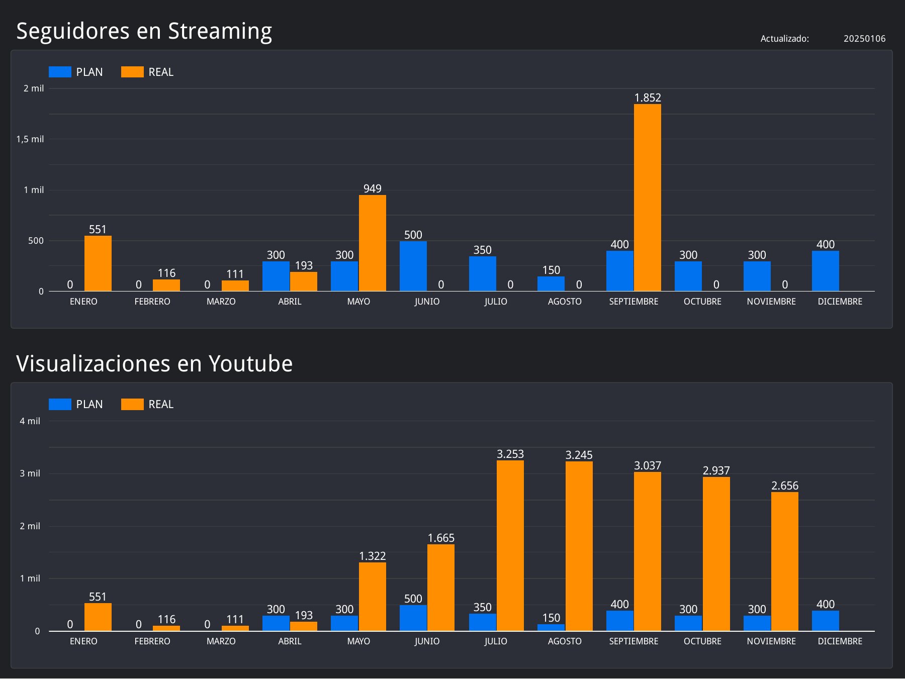
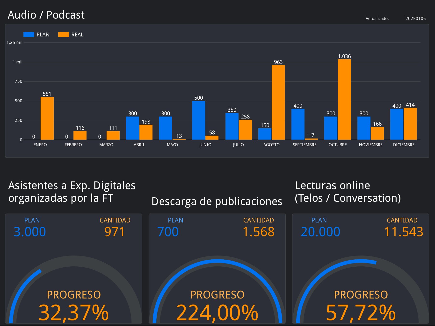
Every indicator in this overview has its own detail screen, described below. They share a consistent layout: a monthly plan vs. real bar chart (blue for plan, orange for real), a gauge with the overall progress, and breakdowns by status, gender or school where they apply.
Program area 1
ProFuturo: digital education
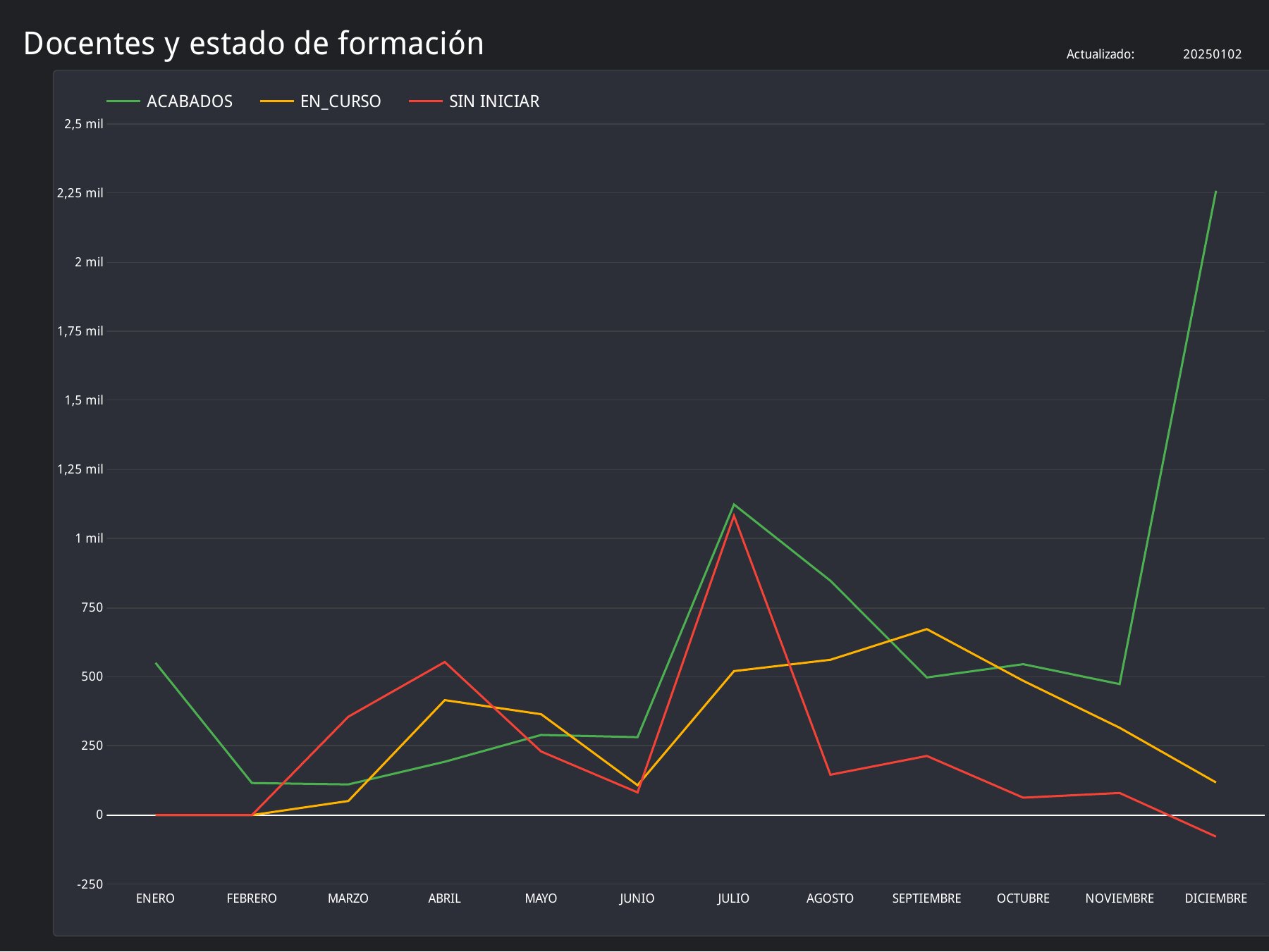
ProFuturo is the digital education program for children and teachers in schools. Its screens follow children and teachers taking part in activities, teachers whose training reaches their classroom, and the children who benefit indirectly. The charts break results down by gender and by schools planned vs. reached, and some screens can be filtered by training call (convocatoria) and course.
For example, the program planned 23,400 children taking part in activities and reached 31,453, a progress of 134%.
Program area 2
Employability and educational innovation
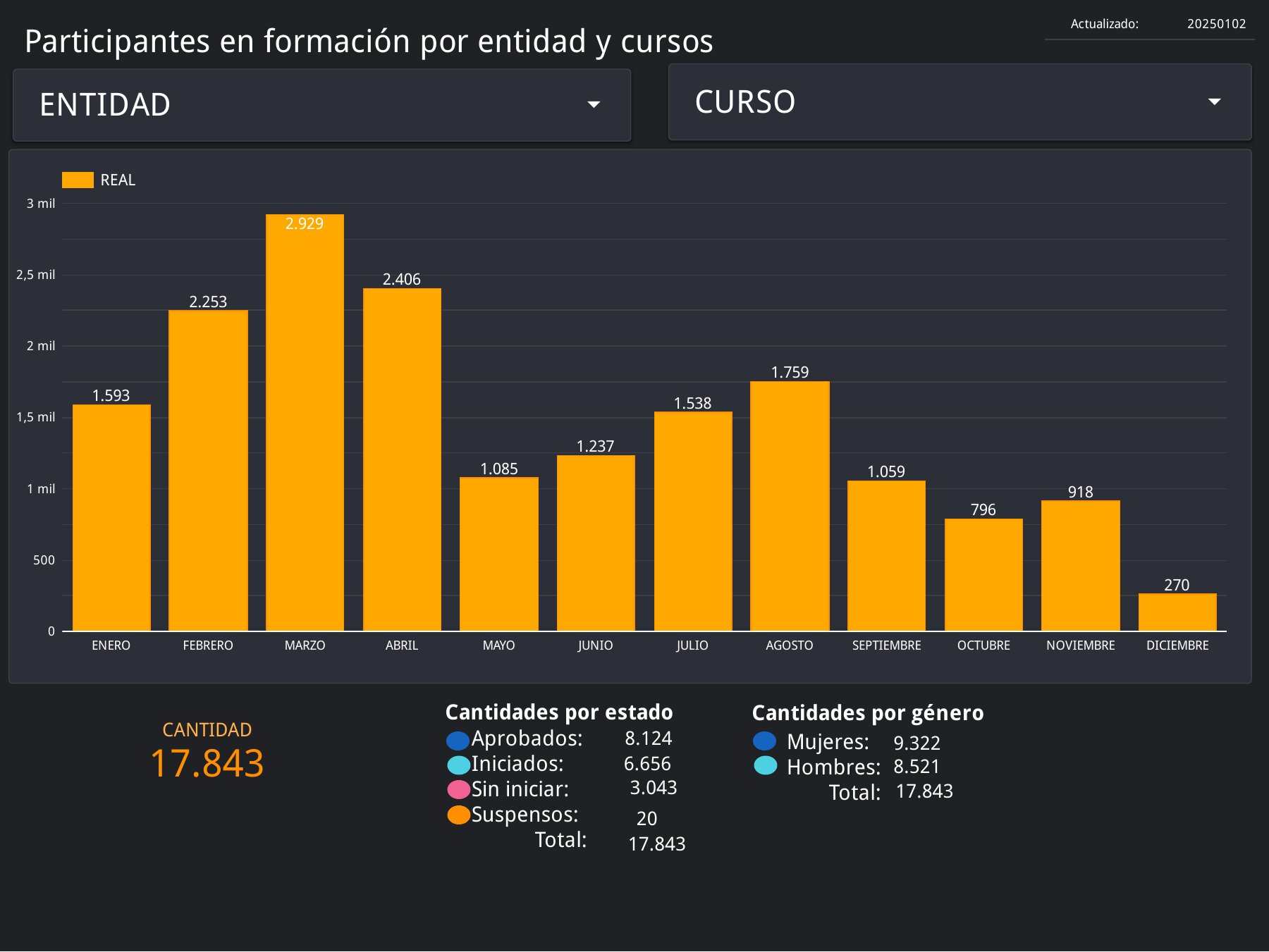
These screens track people taking part in training, educators trained in employability projects, and the people who benefit from those educators. The participant views can be filtered by partner organization and course, and show how many participants passed, are in progress, have not started or dropped out.
Program area 3
Communication
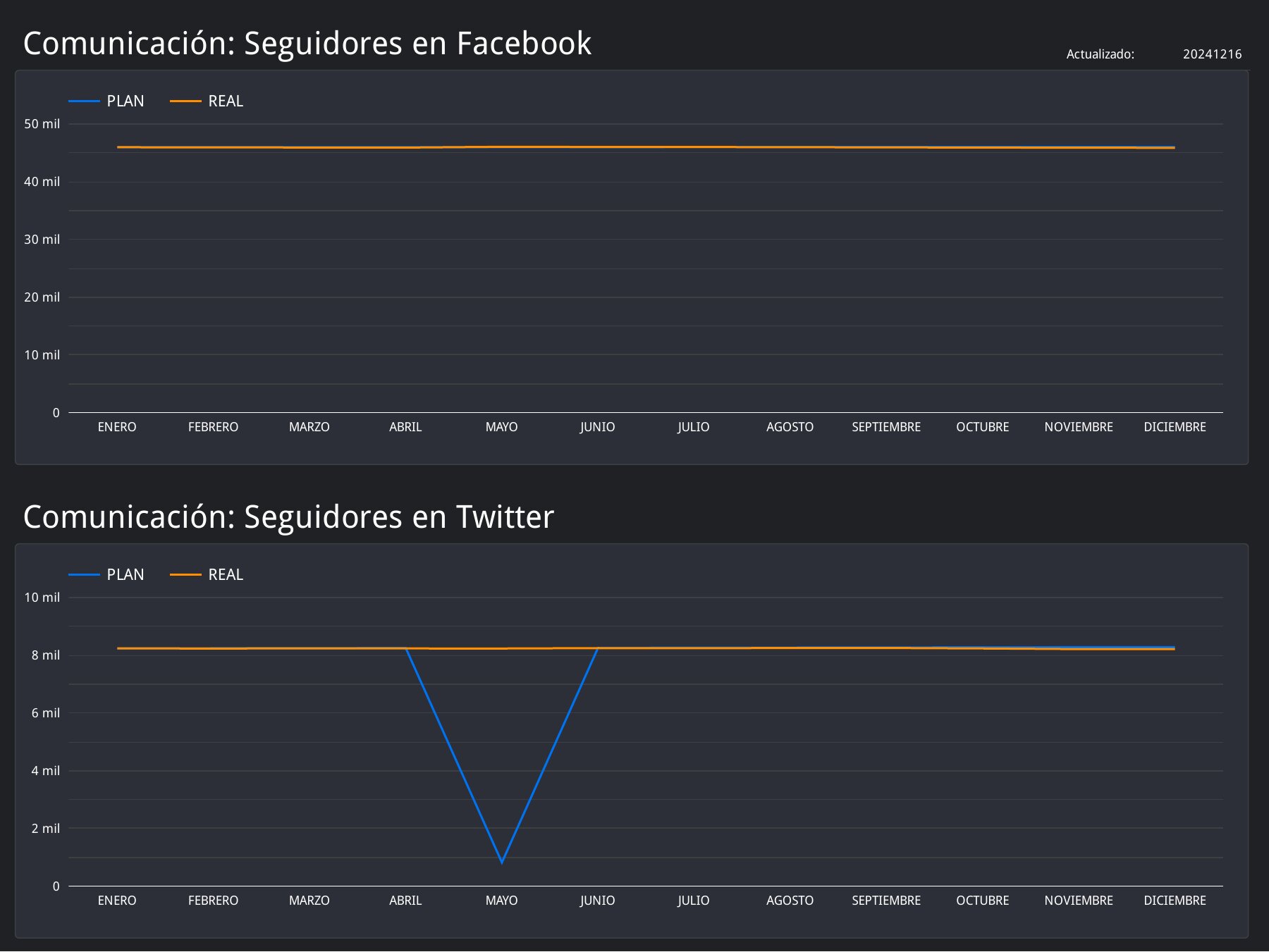
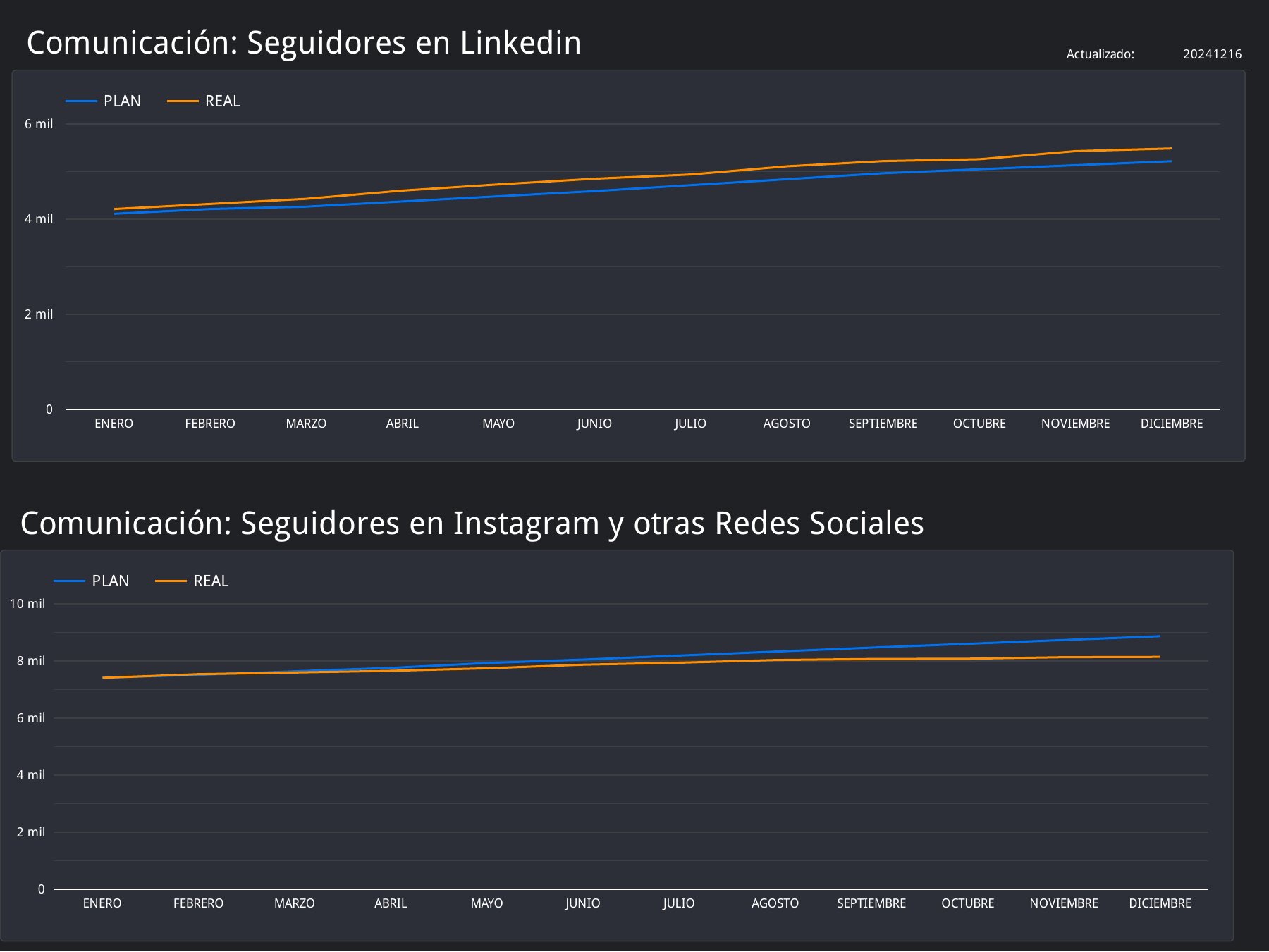
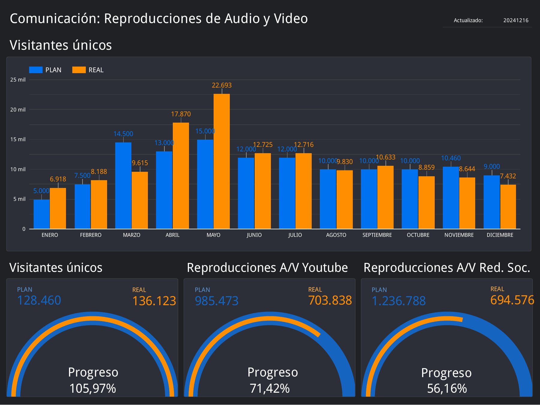
The communication screens follow the foundation’s audience across Facebook, X (Twitter), LinkedIn, Instagram and other social networks, plus audio and video reach: unique visitors, YouTube plays and plays on social networks. Line charts make the steady growth (or a sudden data gap) easy to spot.
Program area 4
Knowledge and culture
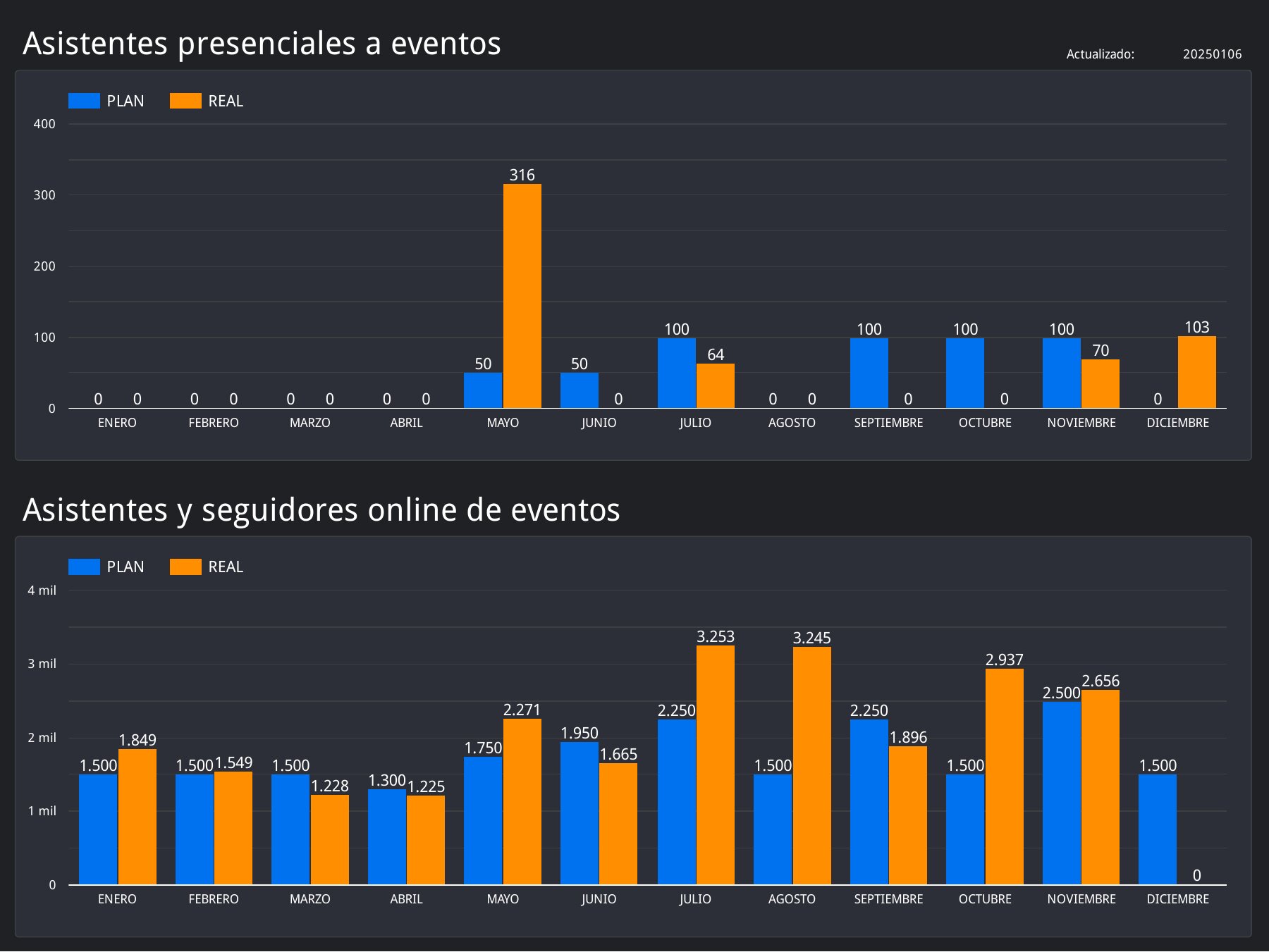
The culture program is measured both in person and online: event attendance, online event followers, streaming followers, YouTube views, podcast listeners, visitors to digital exhibitions, publication downloads and online readings.
Program area 5
Volunteering
Volunteering (direct beneficiaries, active volunteers, volunteering hours and participation in activities) is tracked in the indicators overview alongside the other four areas.
Full report
Prefer to see it as one document? You can download the complete report as a PDF (18 pages, 6 MB).